SisterMuses has a new home on the web! Please update your bookmarks and come join the party at our new website!!!
 http://www.sistermuses.com
Hope to see you there!!!
Merry Christmas and a happy New Year!
SK and J. Leigh
SisterMuses has a new home on the web! Please update your bookmarks and come join the party at our new website!!!
 http://www.sistermuses.com
Hope to see you there!!!
Merry Christmas and a happy New Year!
SK and J. Leigh
In my prior life as a university English professor, all I did was nonfiction writing. I taught it. I wrote it. I lived it. And I discovered something in the process: there is a strong tendency to want to divorce creativity from nonfiction writing. When you take a “creative writing” class in school, no one teaches you about crafting an essay or a research paper. You learn to write poetry and fiction. You learn about descriptive writing and crafting compelling characters. Unfortunately, I’ve never yet come across a creative writing class that focuses on the elegance of the written medium: crafting compelling sentence constructions, learning to manipulate the music of the language to delight your reader…even if you’re writing about astrophysics or remodeling your bathroom. I’m a huge believer in the power and beauty of language. And learning to appreciate and use this tool is truly “creative writing”.

When we’re organizing our table of contents, we don’t often stop to consider that we’re creating something beautiful. But just as there is beauty in the structure of a snowflake and elegance in the symmetry of a flower’s petals, there is beauty and elegance in the logical ordering of a topic. Headings, subheadings, topics, subtopics, indices, appendices…all of these contribute to the order of a work. For nonfiction, the topic determines the ordering techniques. A work of literary criticism won’t have the same structure as a DIY handbook of home repairs, but both will have structure. As you determine how best to organize your work, do it with intention. Is a topical grouping approach best for your topic, or does it require a more architectural approach, with each chapter building on the last? Your book’s structure is integral to the work as a whole, much like the skeleton is integral to the human body. A badly structured book is not likely to be successful, because, ultimately, it won’t be understandable. So consider carefully how to lay out your project, and don’t be afraid to rearrange things in the editing phase if the structure doesn’t flow.
Order operates on both a macro level — the table of contents — and a micro level — the ordering of words and sentences and paragraphs. Both are critically important to the success of your project, and both are opportunities for you to be “creative” in your use of your tool (language).
Yes, fiction is also prose. And it’s helpful to remember that! Just because you are writing about the works of Mary Shelley or the physics of motion doesn’t mean that you have to avoid figurative or descriptive language. But it does mean that your language needs to suit your topic. Elegance and beauty in language can come in many different forms. Language doesn’t have to be ornate and flowery and full of metaphors and descriptors to be lovely. There is beauty in simplicity and clarity too.
Know your topic, and know your audience’s expectations. If you’re writing a serious medical text, humor probably doesn’t have a place. But a book on dieting for mass consumption might call for a dash of humor to lighten up the topic. (Did you notice the food and diet imagery in that sentence? Don’t be afraid to have fun every once in a while! It’s good to make your readers smile.) Proportion is key: too much play with your subject can become tedious, so use it judiciously.
Delighting your reader is one of the best ways to keep them returning to you and your writing. No matter what you write, you will develop a unique style that sets your treatment apart from other books on the same subject. Your style is what keeps your audience coming back. Your readers learn to identify your name not only with a certain unique approach to the subject matter, but also with a mode of expression. The way you use humor, the way you break complex ideas into digestible pieces, the way your sentences flow, the vocabulary you use…all of these contribute to your unique treatment. It’s not too much to say that your style is part of your brand, and it carries through everything you write, whether it’s on your blog or in your latest book. So pay close attention to the way you craft your prose — it will become a hallmark of your work.
As you work on your project and consider your style and approach and presentation, pay special attention to these four areas: diction (word choice), sentence structure, syntactical order, and sentence length. Let’s work through a short example so you can see how powerful tweaks to these elements can be, and how “creative” writing can make an enormous difference in your nonfiction project.
Version 1 (rough draft)
Getting a baby to sleep through the night is a task most parents dread. Sleep training methods seem either harsh (letting a baby cry it out until she falls asleep or the timer goes off) or too time-consuming (some gentle sleep training methods take weeks, if not months, to get results). Parents may feel added pressure from grandparents or friends to “do something” about their baby’s sleep habits. Adding this to exhaustion makes for a desperate situation.
Not bad, but not great. It’s a bit of a yawner. The audience for this piece is clearly exhausted parents who are confused about the best way to help their baby sleep. They’re a bit desperate and strung out, and they may be feeling sensitive or even defensive about the decision they need to make. So let’s try livening this up by addressing the four elements I list above.
Version 2
Whoever coined the phrase “sleeping like a baby” never had kids. Helping a baby learn to sleep on her own is one of the most challenging aspects of parenting, not least because of the dizzying array of sleep training methods out there today. Should exhausted parents set the timer for their baby and just walk away, fighting down tears as their baby wails in her crib alone? Or should they invest weeks — or even months — in a gentle method that may not provide a solution soon enough? And in our social media culture, grandma isn’t the only one sharing her opinion — everyone has something to say about the decision. It’s almost too much for the sleep deprived mind to process.
What do you think? It’s more fun and more relevant, and the flow is much better. There’s a bit of humor in there as well, because this is an emotionally charged topic for many parents, and a smile can cut through some of that frustration.
We could continue to tweak this passage, but I think you get the picture. Creativity isn’t just for fiction writers, so add facets to your work until your gem of a project truly sparkles. Fascinating, creative, and well-organized writing will keep your readers coming back for more!
Hi all!
I’ll be back with some more serious posts next week…but in the meantime, would you like to know a few things about me that aren’t in my author bio?
Like the fact that I have a horrible time making decisions when sunglasses and restaurants with atmosphere are involved?
Or the fact that Silesia: The Outworlder was inspired by a nightmare?
If you’d like to see the rest of my quirky facts, head on over to BestsellerBound Recommends for my “Tell Us One Thing” author interview! (And no, I don’t ship cheesecakes.)
Happy writing and reading!
SK
Hi all!
Goodness…the holidays and the New Year obviously swallowed up the SisterMuses! We have both been busily writing…just invisibly. I am feverishly working on The Artifex (Book III of the Silesia Trilogy), which will be released on August 31, 2013. J. Leigh is immersed in the world of The Madness Project, which she plans to release on June 1. It looks to be an exciting year for the SisterMuses!
Today, I’m over at Engelia McCullough’s blog guest posting about the editing process. If editing always gets you down or you feel daunted by that phase of your literary journey, head on over here for some easy ways to take the sting out of the process! Thanks, Engelia, for hosting me today!
Happy writing (and editing)!!!
S.K.
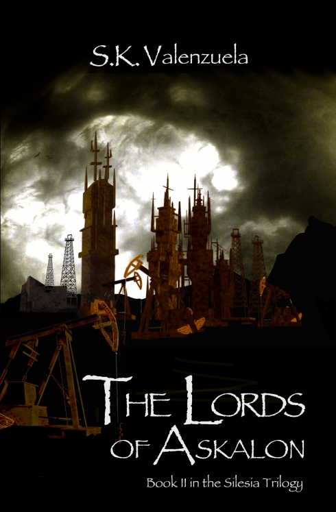
It’s finally here, everyone! So excited to announce the release of The Lords of Askalon, Book II in the Silesia Trilogy! The ebook is available today on Smashwords! The Kindle version should be out tomorrow and the paperback will follow shortly!
A few words of thanks are in order…
To my amazing husband and kids for being so enthusiastic and supportive of this project!
To J. Leigh Bralick, my SisterMuse, my beta reader, and my cover designer! You are a treasure…and it is so much fun to collaborate with you!
To my parents, who always encouraged me to meet any challenge with chin up and a smile…thank you for giving me the confidence to follow my dreams!
And finally…a huge thank you to all my readers and fans who have waited so patiently!
Well, here we are…almost a week into NaNoWriMo…and I have zero words on my NaNo novel. At this point, it’s a NO novel.
Ha.
But it’s for a good reason. I’ve been getting The Lords of Askalon all ready to go to press. Formatting, my friends, formatting. And that’s our topic for today. I’ll lay out some general rules of thumb for print formatting today, and then I’ll run through a checklist for reviewing your print proof later in the week. Then we’re on to ebook formatting and proofing. We’re working on something extra special for the ebook formatting tutorial…stay tuned for that! 🙂
So let’s get on with today’s topic. And I will strive throughout to use the generic terms “book” or “manuscript” instead of “story” or “novel” because formatting applies to any written work — fiction, nonfiction, or poetry.
Reading (even if it’s on an e-reader) is a visual process. Our goal is not only to produce a work that is riveting and inspiring (engaging the imagination), but also one that will delight the reader’s eyes. Formatting your manuscript may seem like the most brainless part of putting your project together, but it’s essential for a number of reasons:
Your work represents a lot of hard work, and you should respect it and yourself. When you dress for a date or an interview, you try to look your best (I hope). First impressions, as they say, are everything. I was a judge again this year for a self-published book contest, and formatting is one of the very first things I look at when I open my box of submissions. Some manuscripts were incredibly professional: beautiful paper quality, excellent font choices, perfect margins and spacing and text layout. I couldn’t wait to dig into those. Then there were the Others. One manuscript looked like the author had printed it out on a dot matrix printer. (If you don’t remember what a dot matrix printer churns out, go look at this example.) It was double-spaced and used courier font…it looked like a rough draft or a school project, not a professional piece of writing. (Sadly, the writing was no better than the formatting.)
Here’s the point: the manuscripts that looked professionally put together made me want to read them. The Others? Not so much. And I certainly wouldn’t shell out $9.95+ for a print book with hideous unprofessional formatting.
Sometimes, bad formatting is like cheap cologne. It’s not immediately, shockingly apparent. It smells okay in the bottle. But God forbid you actually spritz some on before you head out the door. The more time passes, the more bothersome the smell becomes. No one notices your new bag or your incredible smile. They just smell that cheap cologne. Annoyingly imperfect formatting is exactly like this. It limps along for a while, but grows increasingly irritating to the reader, who eventually tosses the book aside. She loses her grip on the story because all she can think is, “Why are there so many spaces between paragraphs? Why is that margin so huge? Why are the chapter headings in a different place each time?”
Here are a few easy steps you can take to avoid the cheap cologne effect of poor formatting:
1. Choose an appropriate trim size. Take a look at some of your favorite books in your genre. Most trade fiction books, for example, are not 8.25″x11″. 5.25″x8″ or 6″x9″ are much more common choices. If you’re writing a cookbook or a nonfiction book, a larger trim size might be appropriate. Children’s books are something else again. Look at what’s out there, find a professional example, and imitate! No shame in that!
2. Follow the template or formatting instructions provided by your chosen press. CreateSpace, for example, has downloadable templates that are already proportioned to your chosen trim size – taking all the guesswork out of margin sizing, header organization, and the like. You’re not cheating if you use a template. You’re saving yourself a lot of pain and tears, trust me.
3. Choose an appropriate text and title font.
4. Single space your work. Use a hanging indent (not a tab) to set off your paragraphs — don’t add an extra space between them.
5. Be consistent. Fonts, margin sizes, indents, headers, page numbers…all these should be exactly the same throughout.
6. Don’t box in your text with borders. This might sound like a no-brainer, but I have seen manuscripts where this is done. It’s highly irritating and distracting. If you want to mark your chapters with a symbol or a glyph that has significance to the story, that’s fine – just make sure it’s proportional to the text.
7. Justify your text. Be sure to set your word processor to break words across lines so that you don’t have weird spacing. Also make sure to select widow/orphan control so that you don’t have straggling bits of lines on an otherwise blank page.
Ensuring proper formatting before you send your manuscript off to press will save you a lot of time and trouble in the next step: reviewing your proof. Remember, you are working for visual simplicity and clarity. Make it beautiful – your work deserves it!
As promised, here’s my post on how to make a book trailer! I hope you’ve had a chance to view my Lords of Askalon trailer on the SisterMuses YouTube channel, but if not, here it is again…
So, now that you’ve finished watching it, I’ll explain how I put this trailer together so you can make one for your own project. It was so much fun to do – and if you hit a writing roadblock or mental wall, doing something that uses a different part of the creative brain can be very helpful!
I followed just eight simple steps to put this together. And be aware that steps 2-4 may happen in a different order than that in which I present them here – I just set things out this way for clarity. But we all know that a creative endeavor is very rarely a linear process!
1. Fire up your movie making software.
I used Windows Live Movie Maker. If you have a Mac, just use the equivalent movie producing software.
You’ll notice that you have a lot of different options – different fades or animations, different visual effects, adjusting the time allotted for each frame, etc. Take a few moments to orient yourself to the software if you’ve never used it before. We’ll come back to these in a later step, once you actually have content.
2. Decide on the feel (mood) you want for your trailer.
There are a couple of factors to consider in this step:
Why is this step critical? You have to identify the mood to be able to choose the right…you guessed it…mood music. And mood images, for that matter. So really do take some time to think about this. In my case, Lords of Askalon is a high-action novel, but there is a significant contemplative thread woven into the story. I really wanted to emphasize both of these, and that helped me to choose the right music.
3. Consider how to present your novel in images.
Now that you’ve decided on a mood for your trailer, you can start thinking about the visuals. Consider your story in terms of its high points. Try to identify the most significant plot points, twists, or turning points. Consider also the key moments for your main character. I suggest using the third approach, because a good story will be both plot and character driven.
For a two-minute trailer, 10 images is really the maximum you can include and still give each image justice. You could certainly do fewer than 10, with more time spent on each frame. So now that you have a general idea what plot or character points you want to use to convey your story, start searching for some images.
I used Foter for my image search. Foter is a huge collection of free, royalty-free stock images. These images are licensed under the Creative Commons license and you can download as many as you like. Let me just offer a few words of advice:
You can also look at Flickr for Creative Commons images and browse by license type if you want, but Foter brings together Creative Commons images from a number of sources, including Flickr.
Look for high-impact, high quality images that convey both the mood and the moments of your story. And sometimes you have to do a lot of searching to find the right images! This step can take some time, so be patient.
4. Add your text.
This shouldn’t be too hard to do once you find your images. And it is a fantastic exercise in high-impact language. I tried to use powerful, mood-based words (i.e., “crouches”) as I presented the story. You don’t need to get into insane detail – in fact, that’s really impossible. Remember, you want to give your reader a glimpse of the story on the levels of mood and plot. Tweak, tweak, and tweak some more until you get just the right flavor!
5. Add your music.
Finding free music is much trickier than finding free images. You can find stock music in many different places, but if you want to make a trailer for free, your options are limited. I found my track at Royalty Free Kings. They had several tracks available for free – most of them pared down slightly from the full version. They have a lot of music available for purchase as well.
Moby (yes, the band) has a free music section of their website for music that they wrote for film. You just need to sign up and then you can browse and download what you like for your project.
You can Google “royalty free music” for some other options as well. Freestockmusic.com has some free cinematic music, for instance. AudioMicro also offers film music, but I didn’t find anything free when I hopped over to check it out quickly just now.
6. Play around with the effects.
Now that you have your pictures, text, and music, you can play around with the different tools and effects to finalize your project. Make sure you have your credits pages (photos and music) and a link to your website at the end so people can navigate to find your work!
7. Beta test your trailer!
Try to have a few kind friends view your trailer and give you feedback before you offer it for general consumption. I subjected my husband and my kids to my trailer (more times than they’d like to count, actually), and made J. Leigh and our mom watch it too! They all gave me valuable feedback. When you beta test, ask your viewers if
Tweak your trailer if necessary.
8. Publish!
You’re ready to post your video! Set up a YouTube channel for yourself, post it on Facebook, Twitter, LinkedIn, your website/blog, Pinterest, reading boards like Goodreads and Shelfari…everywhere you have an online presence!
That’s it, folks! I hope you have as much fun putting your trailers together as I did! And please come back and post a link to your trailer in the comments section so we can all see what you’ve put together!
Happy directing!!!
SK
I’m so excited to share this with you! Here is the book trailer for The Lords of Askalon! Tomorrow, I’ll be doing a step-by-step tutorial on how to create a book trailer like this for your own work!
Enjoy!
Both J. Leigh and I have had two insanely busy weeks — doesn’t that always seem to happen right in the middle of huge and important projects? And it’s obvious that I “missed” my self-imposed publication deadline of October 4 for the release of Lords of Askalon. Part of that is life getting busy — and it’s a luxury (and a curse) of being self-published that you set your own publication schedule. But the real reason why I put off releasing the book is that I took the time to listen — really listen — to J. Leigh, my beta reader.
But what does that mean, exactly — listening to your beta reader? Doesn’t it mean just approving all those deletions and additions in Word’s track changes feature?
No.
Don’t get me wrong. Track changes is fabulous for collaborative work like this. And for incorporating line edits, it can save a lot of time and trouble. But you don’t just give your beta reader carte blanche to rewrite your manuscript. Instead, you need to internalize the criticism and use it to make your story better. Let’s look at how this could play out, using Dr. Banner/the Hulk from the movie The Avengers (disclaimer: this is purely a thought exercise):
BR: I really want to see the Hulk become more thoughtful as the story progresses. He should start moving from “Smash everything because it’s there” to “Smash the enemy because I recognize they’re my enemy” by the end of the film, because otherwise he’s just not very sympathetic or heroic.
Writer: Ah, I see your point. Hmm. I know! If the first time the Hulk becomes the Hulk it’s purely a response to stimuli — uncontrolled and destructive and scary — and then later Dr. Banner chooses to become the Hulk to help his friends, that might convey this change in his character. That means I need to rework this first scene a bit…and really need to highlight the shift in this later scene…and…
Edits like these are macro edits, and they take more time to “fix” than word changes or tense agreement fixes. You have to take what your beta reader tells you — i.e., the Hulk (even for a big guy) is flat unless we have him develop as a character — and figure out what needs tweaking to make your story really successful and satisfying.
Remember, one of the most important things your beta reader does is to go through your manuscript like a reader. You want your story to be satisfying to your readers. If your character has hit a developmental plateau that’s becoming endless and therefore boring and unsatisfying, you want your beta reader to convey this to you. If your plot has a massive hole in it, thus making the story boring and unsatisfying, you want your beta reader to say so. And then you need to listen! Don’t say, “That’s hooey. My story is perfect just the way it is. You’re wrong. I’m right.”
If criticism of your work makes you cringe and feel ill and strikes at the very core of your being, then you’re in the wrong business. And if you can’t take the criticism of your beta reader, then don’t even consider actually publishing your work for the public. Take criticism as an opportunity to improve, not as a personal slight.
So, really maximize the usefulness of having a beta reader by discussing his thoughts on your work. How did this scene work? Could this other plot arc be a problem? Was this shift in character convincing? Is the ending a total flop? Is the climax intense enough? Don’t just cut and paste his line edits into your “finished” manuscript. If you’ve gone through the trouble of asking for a beta read, then make it count. Take your story from “just okay” to “awesome” by listening to what your reader tells you and considering how best to adjust.
Your readers will thank you for it.
It’s Sunday (and that’s my fun day)…and I finished The Lords of Askalon on Friday – which means that I’m on target for its release on October 4! What do these two things have in common? It’s time for a celebration!!! I thought I’d share with you a ridiculously easy and supremely tasty recipe today, for those times when a straight-up cup of tea just won’t do the trick. (And if tea’s not, well, your cup of tea, this might change your mind).
No, it’s not a writing post. But tea and writing mix beautifully, don’t you think?
Enjoy!!!
6 cups water
1/3 cup sugar
Zest and juice of 2 limes
2 cinnamon sticks
3 black tea bags – I love Twinings Lady Gray, but you could use English Breakfast or Earl Gray or your favorite black tea
Bring water, sugar, lime zest and juice, and cinnamon sticks to a boil in a large saucepan. Stir to dissolve sugar. Remove from heat and add tea bags. Let tea steep for 15 minutes. Remove tea bags and let mixture stand until it is room temperature, about an hour. Strain mixture into a pitcher and refrigerate until cold. Serve over ice.
(Adapted from the Spiced Thyme and Lime Iced Tea recipe by Giada de Laurentiis)